Articles-Colour Sensations
Leap into the sensations of the season with zing and go into full bloom! Take inspiration from the season and zing it with the sensations of the hot color trends of summer 2011.
Eucalyptus
With names such as Dried Herb you may be wondering how Pantone comes to peg these colours as trends? Pantone simply interview New York fashion designers and collate the data. Like ourselves, they understand the importance of new collections and colours in determining the future of many a fashion label. As such, "the vibrancy of the top five colors, versus the neutrals we see toward the bottom of the ranking, show that designers are choosing optimism for the season. Without any brash colours in the mix, the hottest trends are optimistic yet cautious. Dive into colour and don't hold your breath! Being bold is not brass! Refreshing splashes of brights, perfectly punctuate the classics this season.
REMEMBER: Cautious not brash, bold but not overwhelcoming, should guide your choices this season.
Variations on popular colours, such as an energizing red, cool but not cold waterborne blue, and eco-friendly gorgeous greens, also play a key role. The palette potential perfectly reflects the cheerfulness of the season and sings.
Terrific trend setting high notes
The song of colour will surely sing to you this season, but you must listen to the TONE that reflects your inner song and tune in to what blends harmoniously! If you can ZING, please always remember PLANNED COLOURHOOD, as it is the only safe way!
Colours come into prominence from decade to decade driven by influences ranging from the economy to world politics and cultural phenomena- the once old, becomes new again! The once aged, has a new time and place in your interior design choices. This Season think new beginnings, using surprising neutrals sparingly with innovative splashes of captivating corals, yummy yellows and passionate purples to create a spring in bloom. Violet, turquoise and tomato are sure to be noticed and in their own fresh way, neutralized!
SHOW YOUR STUFF! Tarragon is the freshly cut stem to the blossoming shades of sweet Strawberry Ice, warm Golden Apricot and violet-infused Hollyhock. Café Crème is the rich, creamy contrast to the serenity of calming Sky Blue or the deliciousness of refreshing Grapemist.
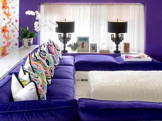
Watch for the surprising PURPLE TONED wall with CORAL accented pillows and feel revived and joyful!
The yellow glow of gleaming Green Sheen and the blushing beauty of diaphanous Silver Peony reflect the infusion of life.
The freshest new neutral is found in glimmering Opal Gray, with hints of purple undertones, providing the background to multifaceted, complex brights that can make even the most basic silhouette come alive.

Your walls are your canvas, so be sure to relate to your environment and make that commitment to COLOUR! Be aware that beige is not beige but rather laced with undertones of either green, blue, brown or gray. Each of which makes a huge difference in the overall affect of your home. Review colours in various lights and different times of the day and night. Test swatches on your walls. Yes, it can seem like an insurmountable task. It is not a long term commitment however, hey, it's only paint!!! The power of the brush, is in your hands! We long to be adventurous and free spirited, but something gets in the way.
Maybe it's a fear of judgment or a painful memory of the last colour gone wrong? Maybe it's the misconception that a colourful decor has to be ALL bold and bright. Well, it's time to build up your colour confidence which so reflects your LIFE!
It's not all black and white! DO determine the overall mood you'd like to create before choosing colours for a room. To create a bold look, choose high-energy colours like brick, terra-cotta, antique gold or pompeian red. For a seductive scheme, pick smoky charcoal, mauve or pewter. The OLD basic Black lends way to the NEW charcoal, pewter and silver toned accessories, that can anchor a room and secure your seductive colourful thoughts!! To play up a room's prettiness, select a palette of blush pink, oyster and icy blue don't forget the mauve. DO establish a colour scheme and THEME it, throughout the whole house (or at least the main floor) at the outset. Meld midtone khaki walls in a living room which look fetching when viewed from a putty-colour entranceway. A consistent trim colour throughout further emphasizes the connection between rooms.
Seamless movement from one room to another is the essence of GOING WITH THE FLOW!
There are many shades this season that are more than palettable!! DON'T ignore nature's palette, which encompasses many colours. Be inspired by the multiplicity of tones and textures that gives natural hues their depth. Watch for STABLE AND SECURE options that you need not fear! Face these exciting choices head on! Stabilizing neutrals combined with pops of brighter colours to create unique, distinctive looks are the basis for a great summer update. Catchy Cantaloupe and not so bashful blues compliment the freshness of this season's sensations! Welcome these shades And Colour your world with Planned Colourhood- Remember it is the only safe way!!!Colourful considerations: Paint with passion:
Blue is back on the palette of choice and with a vengeance. In particular, manufacturers have worked on spring's electric blues and turquoises to produce a wide range of attractive tones. This year the blue /green hues have taken off, and even if it is not your favourite colour a blue/green tint or accent tease, is a seasonal must-have. Remember blue undertones in your classic beige, white or grey makes a huge difference. Am I blue...?... is a serious interior fashion question you must ask yourself today!
Purple, Puce to Pink Colours for this season are hot hot hot! Lilac, magenta and purple puce are creative punches that will add some zest to any room. The purple mauve tones have been a very strong fashion colour trend since 2007, and now there is a tonal merge with orchid lilac to bluebell. Frequently the purple colour group is set against the hot pinks, cerise and softer pink orchid tones.

I admire the palette with peppy pinks frequently mixing with other bold brights. Boldly go where fashion has gone and bring it into your home with flair. TRY pink next to orange. Wow factor! Coral, rose amethyst, purple and surprisingly, lemon yellow or green will electrify a tired decor. Tie one on! Enhance with painterly watercolour effects. You will see this in many fabric option this season. All the warm colours show their lively brilliance, from coral to soft peachy watermelon. By autumn, burnt tangerine will emerge from the more delicate peach tone on offer this spring. I always like it hot! Those are my favourite choices indeed!
Don't resist the importance of that yummy yellow creeping back into the palette. Yellow is a tone you either love or hate. My bet is that if you are fair you will love lemon and yellow. The lemon yellow tones are mingling too with mustard, olive and khaki greens. Think of the mixed citrus skin on a lemon that veers toward lime.
Black and White Monochrome Options are a continuing strong trend. Welcome plenty of intense velvety purple with blue depths found in the iris, and in the twinkle of bluebell fields. Add black or white to these main colours and see how the resultant dusty aubergine, and the darkest rich plums, all play for attention.It will be hard to miss. Don't miss out on this playful colour attitude!